UI Improvements! DR4X mini changelog
So I worked some ui updates into the noderooms branch today. Here are the highlights
Changes:
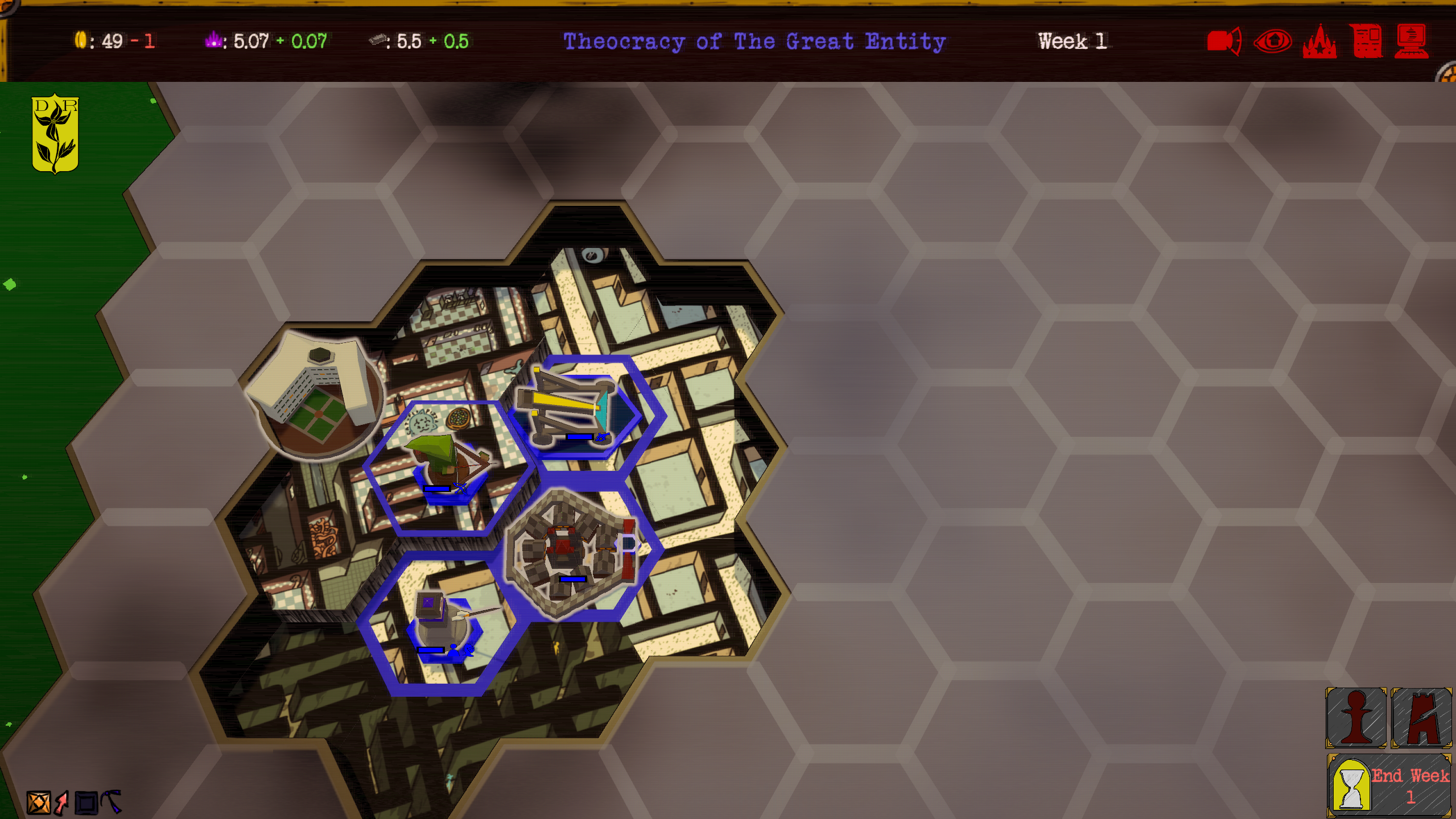
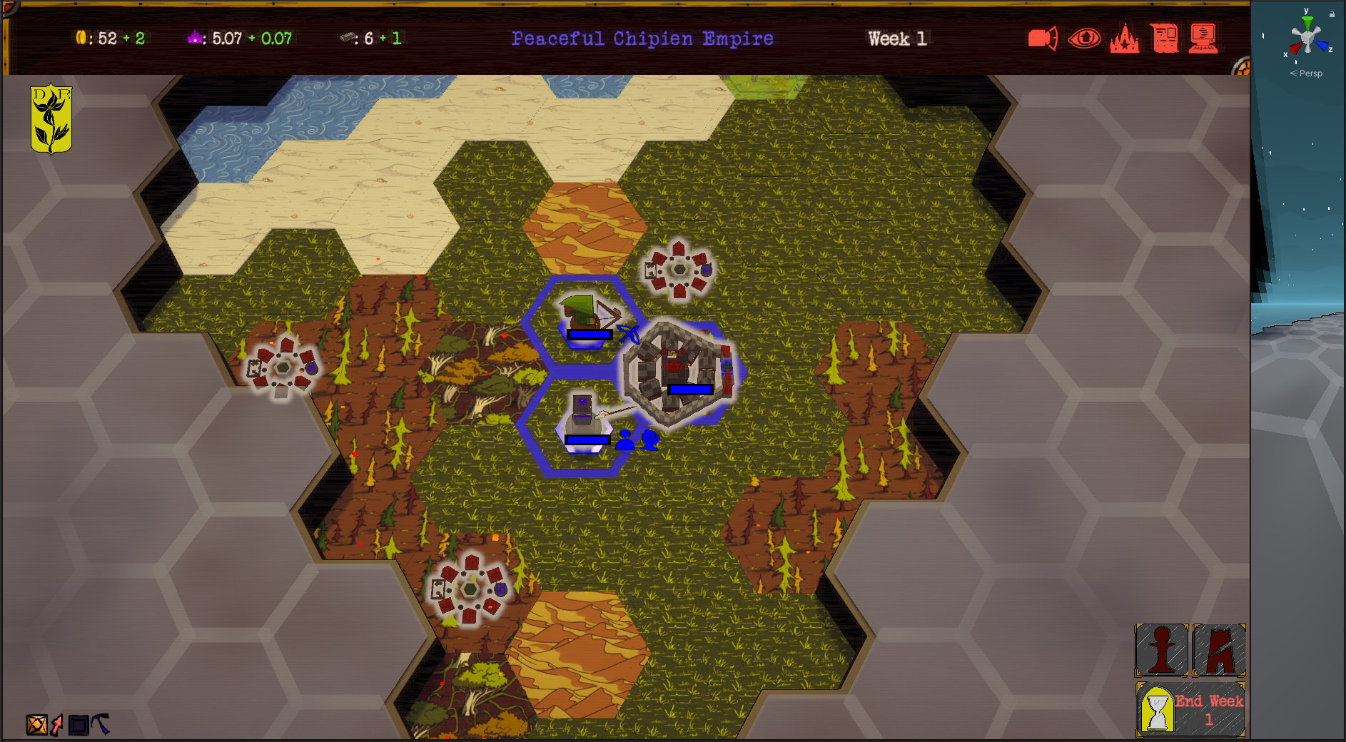
-Completely revamped lighting setup, things were simply too bright, especially on noderooms maps
-Moved camera buttons to top of screen and cleaned that up.

The red is unique to my setup, you will have whatever color your ui is (as it is randomized per player via fun values)
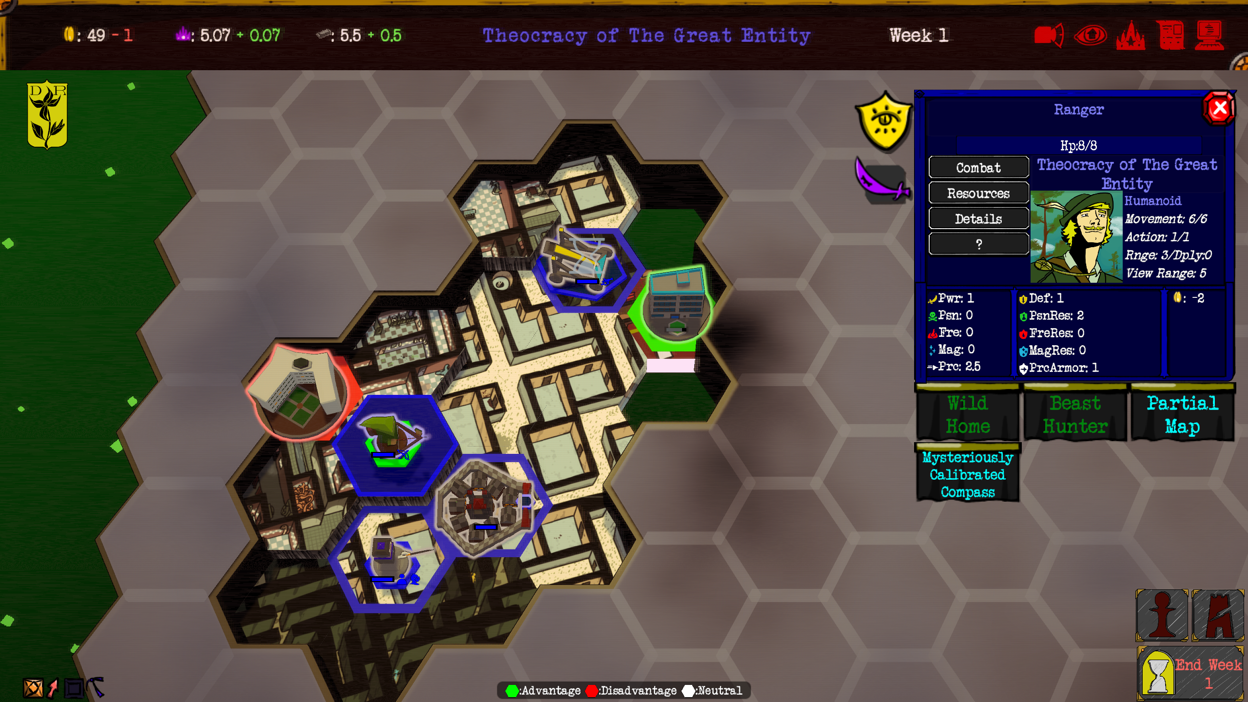
-Units/Buildings now have a light gray outline. This outline will change color when attacking to reflect advantage disadvantage etc aswell this is to make it easier to see units on busier tiles like forests.
(I am planning to also add a new map mode that will color the outline based on team color)

-When attacking the game gives you a little key at the bottom of your screen explaining advbantage disadvantage neutral (they also have tooltips if you want to know what exactly each color does) this is because people still weren't quite getting it.

-AI is now way better at exploring
(Thisis on top of earlier improvements, basically they use idle units to explore a bit now too)
-Turns out I accidentally nerfed the AI a while ago, it should attack properly again lol
-Fixed typo with deep entrance tooltip
-Cleaned up ui in other spots too
-Reduced mesh size of walled cities so they don't hang off of tiles quite so much
-Abandoned apartment now gets proper lighting/shadows on it
-Liminal decorations dont have the outline. This is to keep them looking liminal
Files
Get DR4X
DR4X
A fast haunted Micro-4X game with roguelike elements and asymmetric factions.
| Status | Released |
| Author | Untrustedlife |
| Genre | Strategy |
| Tags | arg, Casual, Dark Fantasy, drax, Fantasy, Fast-Paced, Horror, rldr, Turn-based Strategy |
| Languages | English |
| Accessibility | High-contrast, Interactive tutorial |
More posts
- Dr4X Is Now Fully Released!Jun 25, 2025
- Itchio Wiped My PagesDec 13, 2024
- Sorry Speedrunners...I fixed a bug.Oct 31, 2024
- More tweaks...Jun 25, 2024
- Fixed major bug with ending sequence.Jun 25, 2024
- Learned a lessonMay 29, 2024
- Reduced DR4X Price for forseable future.May 29, 2024
- Plans, and changes: DR4X Devlog 5/28/2024May 28, 2024
- Whats been going on? DR4X Changelog! 5/18/2024May 19, 2024
- New intro and shorter load times. DR4X Changelog! 4/27/2024Apr 27, 2024

Leave a comment
Log in with itch.io to leave a comment.