Graphics Updates For Comprehensibility (Minor update)
Hey folks! So I went in and touched up a bunch of the 3d models. SInce i've gotten better at blender to distinguish them better from above and to make them more interesting to look at, also added a new building to liminal skirmish maps, the liminal grocery store, with its own model, description stats and name generator. That replaces farms on the liminal tileset when you choose noderooms etc in skirmish.
Changes:
-Remade hooligan model
Henow has blood on its hands (literally) more detailed . a beared and red eyes and more detailed hair.
-Touched up arsonist model (He has a more visible smoking implement etc)
-Touched up warrior model, they now have a differnet shape and more detail and they hold their sword p[roperly (which is also more detailed) so they look way more distinct from above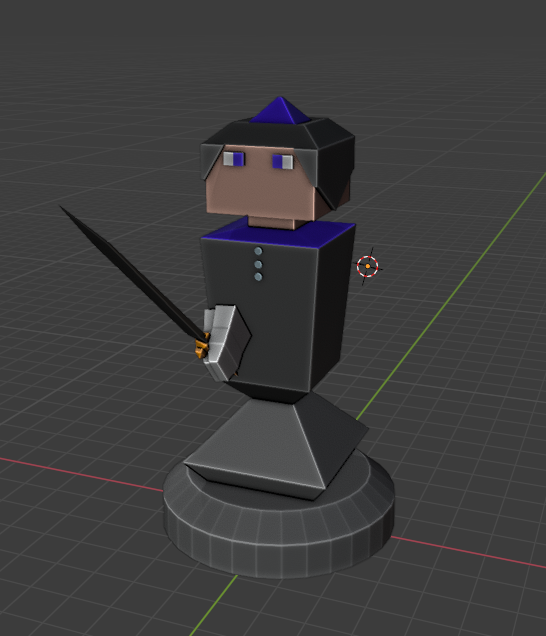
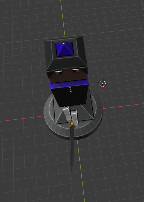
-Touched up ranger model so they look like archers from every angle and made their bow bigger so its easier to see from a distance
-Strigoi bro (in both his hatted and unhatted form) now has more detail and his own model (This is to distinguish him from non-boss strigois ) He also has a different color scheme than the normal stigoi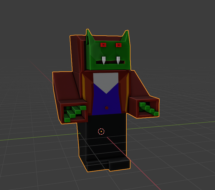
-Heavy caval;ry now looks more like its actual unit portait with full body armor (also its horse looks more like a horse)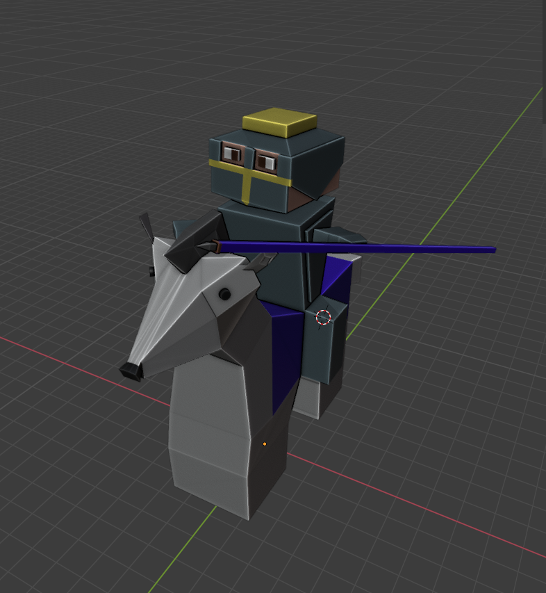
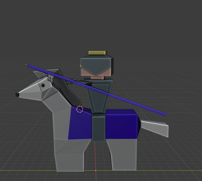
-Light Cavalry now looks more like his unit portait with a larger sword and a better horse.
-Cavalry archer now looks more like her unit portait and her horse also looks more like her unit portrait also she looks liek an archer from every angle (so no more confusing her with the light cav)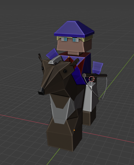

-Updated B-a-ll-a-a-l model to look more aged
-Updated GSBTBTU model
-(And other model updates I dont remember)
-Also tweaked farm description
-Also replaced the words for resources with the resources icons in many places
-Added liminal grocery store with accompanying name generator (it doesnt have unique art yet so just uses farm portrait)


That model will probably get more work , it was my first attempt at modeling something liminal.
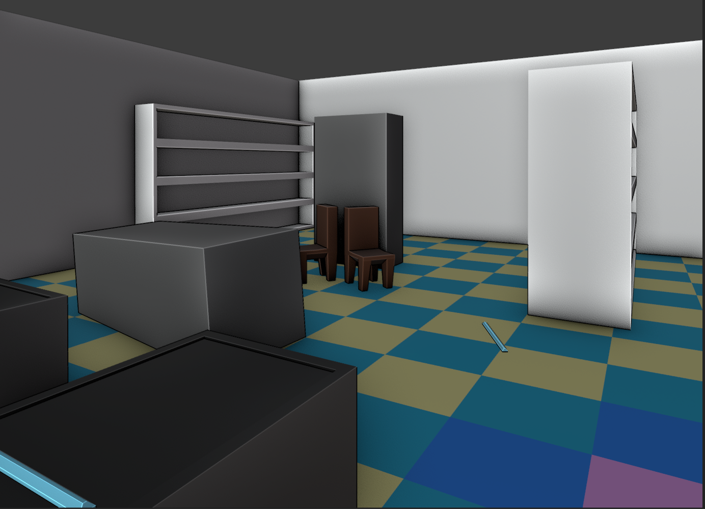
But it fits the aesthetic of the noderooms tileset so.
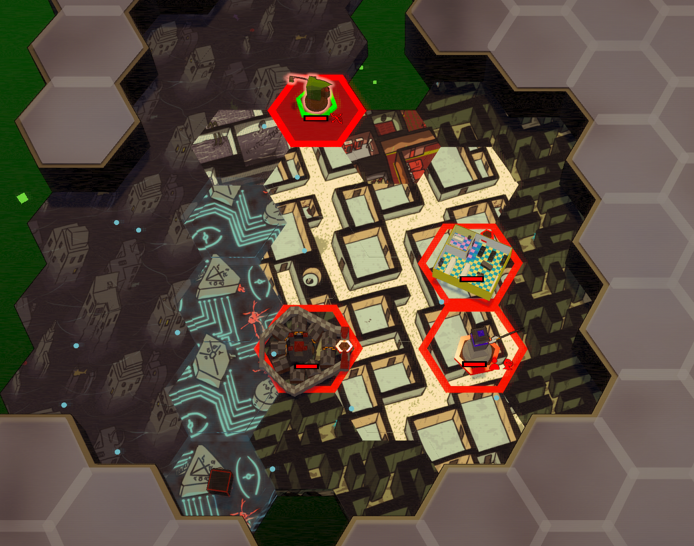
Thats it for today!
I've always been intrigued by the anachronistic idea of a medieval kingdom existing in the backrooms. It raises an interesting question: if the backrooms were eternal, how would they have appeared in the past? My guess is, not much different. However, I'm planning to update them more soon, replacing towns, cities, and settlements.
This week, I couldn't accomplish what I initially intended, as I got quite absorbed in the modeling part. Ah, well!
In the devlog I shared last week, I mentioned my eagerness to return to the secretty secret stuff in preparation for the upcoming chapter. The liminal elements will feature in future campaign chapters (not Chapter 2, but in one of the subsequent ones), just giving you a glimpse of what might be in store about a year down the line from now.
What are folks thoughts on me adding screenshots of various tilesets to the store page? There are several unique ones, some of which you might have encountered while experimenting with the skirmish mode settings.
Each tileset offers a different experience. Some alter many tiles, while others change just a few.
For instance, there's a tileset inspired by Mario and cartoons. I even created special treasure chests for this one, resembling the '?' blocks (though they're not currently in use).

Then we have a tileset with a sorta horrory Bmovie theme, adding a spine-chilling twist.
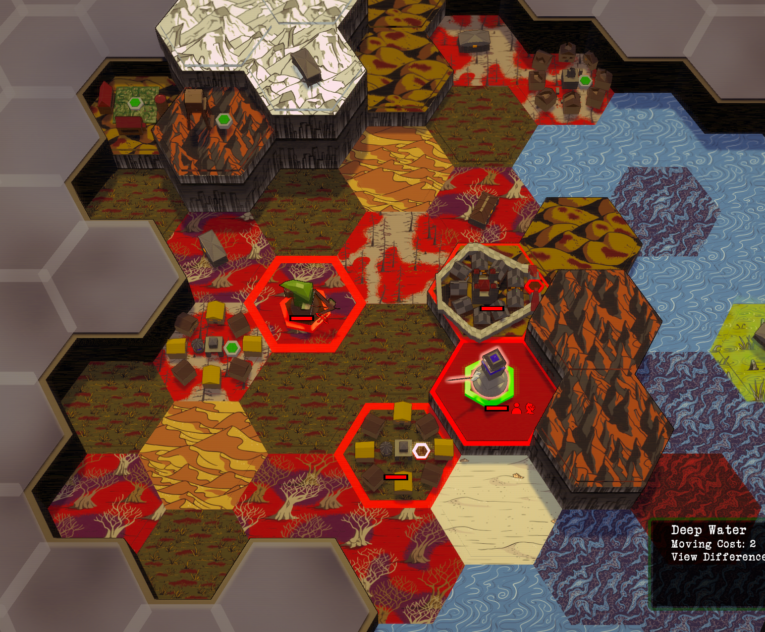
And the noderooms, which embody the classic liminal space aesthetic.

And, naturally, the standard tileset is also available.

Displaying these on the store page could give a better insight into the game's visual variety. What do you guys think , should i show them?
It's a feature that I've included for a while now, primarily to enhance the visual diversity in campaign missions and to surprise players when they select specific settings in skirmish mode. (Once i have a few more i might make it just directly choosable in skirmish, but right now its tied to different "setting" options. (This is actually important as it impacts gameplay; the different tiles have varied characteristics. On some, visibility is reduced, while in others, the movement cost is higher. And I have had to tweak balance on all the settings based on this. Additionally, with the game's advantage-disadvantage system, altering the tiles means players need to adapt to different combinations of advantages and disadvantages and teh liominal maps also include void tiles (I dont think i use them anywhere else...) which are only traversable by units with the flying or ethereal flag.,)
Files
Get DR4X
DR4X
A fast haunted Micro-4X game with roguelike elements and asymmetric factions.
| Status | Released |
| Author | Untrustedlife |
| Genre | Strategy |
| Tags | arg, Casual, Dark Fantasy, drax, Fantasy, Fast-Paced, Horror, rldr, Turn-based Strategy |
| Languages | English |
| Accessibility | High-contrast, Interactive tutorial |
More posts
- Dr4X Is Now Fully Released!Jun 25, 2025
- Itchio Wiped My PagesDec 13, 2024
- Sorry Speedrunners...I fixed a bug.Oct 31, 2024
- More tweaks...Jun 25, 2024
- Fixed major bug with ending sequence.Jun 25, 2024
- Learned a lessonMay 29, 2024
- Reduced DR4X Price for forseable future.May 29, 2024
- Plans, and changes: DR4X Devlog 5/28/2024May 28, 2024
- Whats been going on? DR4X Changelog! 5/18/2024May 19, 2024
- New intro and shorter load times. DR4X Changelog! 4/27/2024Apr 27, 2024
Leave a comment
Log in with itch.io to leave a comment.